Saturday, 9 May 2015

EXP2 - Final Submission

                       3 textures:


Five images:
The image above shows the site of the Mark and its relationship with The Blacktown International Sport Park and the landscape.I chose the phone tower place to set up the Marker because two crossed highways are over which means there are more people can see the Marker when they driver by.The marker cross the highway. It like a bridge to connect the soccer site and the baseball which are separated by the highway.

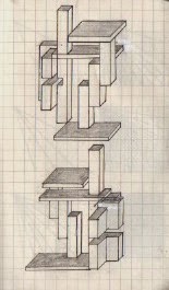
It can be seen that the Marker was divided into two components that are connected by a long block. Two curvillinear masses was inspired by the shape of the Aboriginal hunting tool--Boomerang. The black component has a mass (transformation from 3 blocks) with a traditional Boomerang shape that stand for the past of the Aboriginal people. But another curvillinear mass is more organic that stand for the future.


The white vertical block in the above image keeps the same texture with the black one to indicated that something in the Aboriginal life have changed but something still existed. And the light through the voids of these blocks can cast a beautiful shadow as the below image shown. ( look at the surface of white curvillinear mass)

Both of the components have one horizontal block use as the public zone (part of the details showed in the below image). The ground one is easy to access. 

The dot texture was inspired by Aboriginal Art Symbols.


Lumion Dropbox link:
https://www.dropbox.com/s/lox11f8t68v0paw/marker-qiumanying.ls5?dl=0

Wednesday, 6 May 2015

EXP2-Developed Marker

Textures used in model:


EXP2- 36 Textures


EXP2- Three Drafts: Modelling in Sketchup and experience with Lumion

Draft1:


              Draft 1 set in Lumion:


                                                                            Draft2:


      Draft2 set in Lumion:


Draft 3:


Tuesday, 31 March 2015

EXP1 submission


Two clients
Above: Rolex (word: exquisite)
Below: Christian Benner Custom (word:chaos)

2D section:

overall view:


the below studio:
                                             
                                                                   cross section:


 The above studio is divided into six smaller units and arranged in order. These smaller units have the same shape but different volumes. To reflect the word "chaos" in the below, I grouped two polygons and four boxes together (one was set in the right polygon) and textured in a  random way. The boxes act as the main structure and the polygons are more like decorated function to make the exterior more complicated. As it can be seen in the cross section, the first two joint boxes used for exhibition.  The external textures of the showrooms are consistent with their studio's.  Most of the materials I used in the below studio are translucent to create a sense of an open structure. The whole building is embedded in a hill to accommodate its irregular shape.

Textures being used:


1. luxurious


2. shiny


3. dense


                                                            two draft models:


Animation of the exterior:


Animation of the interior:


Animation of the section: